What Makes a Print an Original Work of Art?
In my studio, I find myself constantly navigating a language barrier. When I tell someone I’m working on a "print," their mind often goes to a digital file—a high-resolution scan of a painting, reproduced by a machine. This is a reproduction, or a giclée. It is a copy of a work that exists elsewhere.
But in the world of professional printmaking, an original fine art print is a primary object. It is an image conceived and executed specifically for the press. There is no original painting behind La Séptima II. The work you see on the paper is the first and only manifestation of that vision.
To understand why these works hold their value alongside unique canvases, you have to look at the engineering, the chemistry, and the collaboration involved in the process.
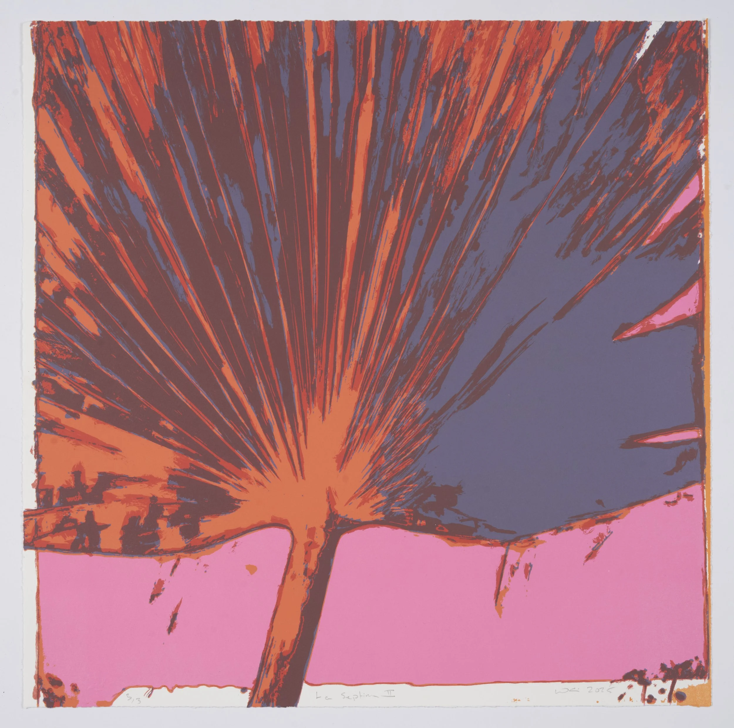
La Septima II, 2025
The Professional Collaboration: Working with Obee Editions
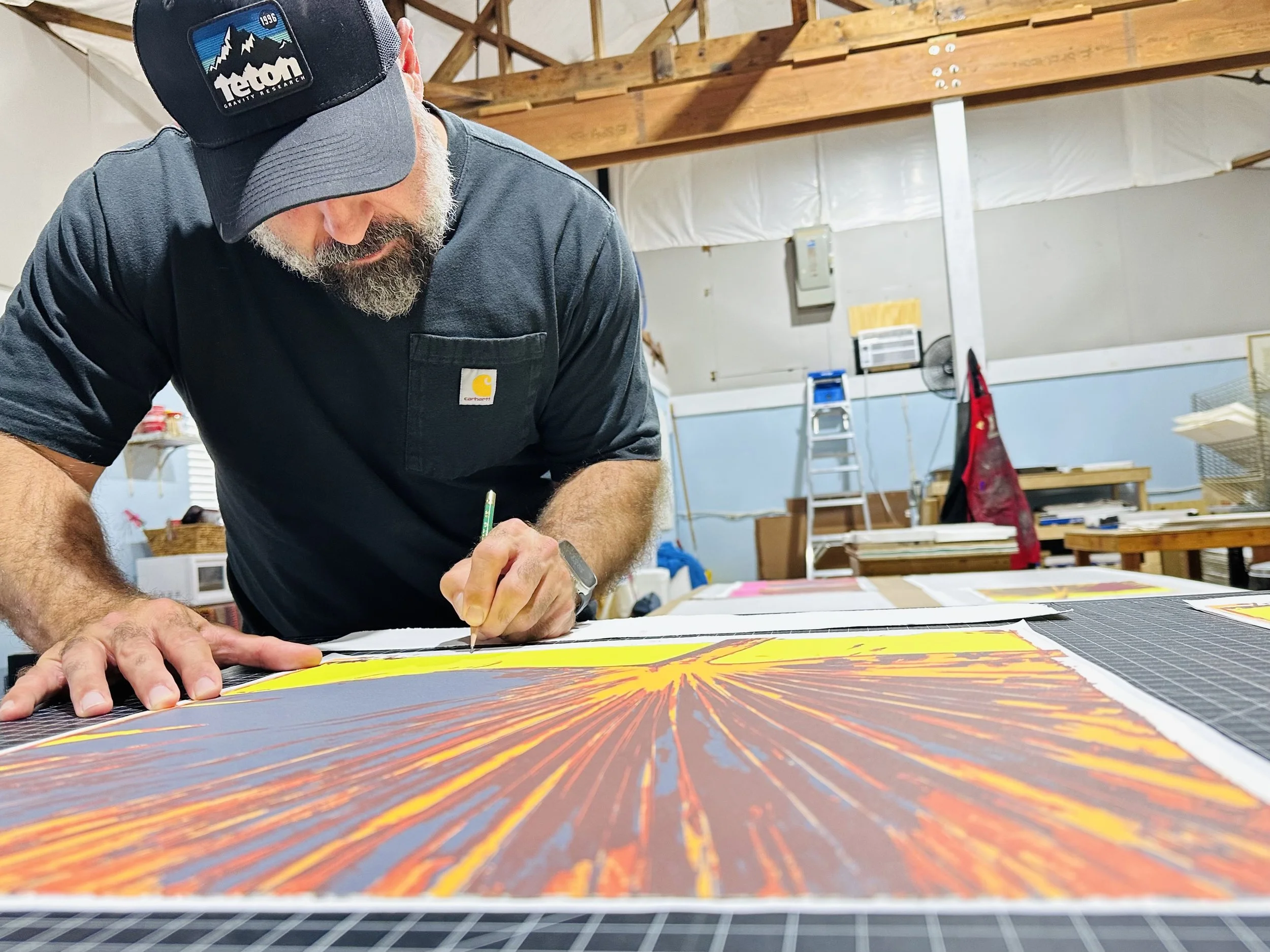
I don't produce my lithographs in isolation. For a piece like La Séptima II, I worked with Perry Obee at Obee Editions.
The relationship between an artist and a Master Printer is one of technical trust. Perry is a Tamarind-trained Master Printer. The Tamarind Institute is the global benchmark for lithography; it produces printers who understand the volatile science of the medium. When I bring a concept to Perry, we aren't just "printing." We are managing a professional dialogue about ink viscosity, paper dampness, and the chemical stability of the plates.
This collaboration is a hallmark of original fine art prints. When a collector acquires this work, they aren't just buying my vision; they are buying a piece produced to the highest professional standards of a specialized publishing house.
The Science of the Matrix: Lithography Explained
Lithography is a planographic process, meaning we print from a flat surface rather than a raised block or an etched groove. It is based on the simple chemical fact that oil and water do not mix.
The Drawing Phase
To create the matrix for La Séptima II, I drew directly onto four separate plates using greasy materials—litho crayons and tusche. This grease becomes the "image area."
The Etch
Once the drawings are complete, Perry "etches" the plates. This is a bit of a misnomer; we aren't eating into the metal. Instead, we use a mixture of gum arabic and nitric acid to chemically desensitize the non-image areas. This makes the bare metal water-receptive (hydrophilic) and the greasy marks oil-receptive (lipophilic).
The Press
During the run, the plate is kept damp with a sponge. When the roller—charged with oil-based ink—passes over the plate, the water repels the ink, and the greasy marks attract it. This is a high-stakes balance. If the plate dries out for a second, the ink "fills in," and the plate is ruined. Every one of my original fine art prints is the result of maintaining this chemical equilibrium through every single pass of the press.
Deconstructing La Séptima II: The Four-Color Breakdown
La Séptima II is a four-color lithograph. This means the image was physically built in four distinct layers. Unlike a digital printer that sprays all colors at once, we had to run the entire edition through the press four separate times—once for each color.
The Base (Pink): This plate provides the atmospheric warmth. It’s a solid field that dictates how the subsequent colors will "read."
The Mid-tones (Orange and Violet): These two plates build the body of the leaf. Because lithographic ink has a natural transparency, the violet sitting over the orange creates a depth and an "optical" color shift that you cannot achieve with flat paint.
The Structural Darks: The final plate defines the architecture of the leaf—the veins and the deep shadows.
The Challenge of Registration
One of the most difficult technical aspects of original fine art prints is registration. Since the paper passes through the press four times, it has to land in the exact same spot every time. If it’s off by a millimeter, the lines blur and the image loses its integrity. We use a system of pins and marks to ensure that the "four-color breakdown" aligns perfectly.
The Substrate: White Somerset Satin
The choice of paper is a critical part of the work's identity. For this edition, we used White Somerset Satin.
Produced by St Cuthbert’s Mill in England, Somerset is a 100% cotton, mould-made paper. It is pH-neutral and acid-free, which is the baseline for any archival work. But I chose the "Satin" finish for a specific reason: it has a smooth, velvety surface that accepts the lithographic ink with incredible detail without being overly glossy.
When the paper goes through the press, the pressure is immense. The Somerset paper is actually driven into the plate, "embossing" the ink into the cotton fibers. When you handle these original fine art prints, you can feel the weight and the texture of the ink sitting within the paper, not just on top of it. This creates a tactile presence that a digital print on standard paper can never emulate.
The Scarcity: An Edition of 3
This is perhaps the most important aspect of La Séptima II. While many original fine art prints are produced in editions of 25, 50, or even 100, I chose to limit this edition to just three.
From a production standpoint, an edition of 3 is an outlier. We go through the same weeks of preparation, plate-making, and proofing for 3 prints as we would for 50. But by stopping at three, the work becomes a "multiple original." It occupies a space of extreme rarity.
Once those three prints (and a small number of Artist Proofs) are pulled, the plates are effaced—the image is physically scrubbed off the metal. This ensures that the work can never be reproduced again. When I sign and number a print as 2/3, I am certifying that there are only two other physical objects like it in existence.
Why I Create Original Fine Art Prints
I’m drawn to the press because it offers a specific kind of mark-making. There is a grainy, atmospheric quality to a lithograph—the way the ink hits the "tooth" of the plate—that is unique to the medium.
For the collector, original fine art prints offer a sophisticated entry point into the art market. You are acquiring a work that represents a month of labor, the expertise of a master publisher like Perry Obee, and the history of a medium used by artists like Picasso and Rauschenberg.
Caring for Works on Paper
Because La Séptima II is printed on 100% cotton Somerset paper, it is a living material. It breathes. To protect your investment, there are three non-negotiable rules for framing:
Archival Materials: Never use standard "acidic" mat boards. They will turn the edges of the white Somerset paper yellow over time. Specify 100% cotton rag matting.
UV Protection: Use UV-filtering glass. Even the most lightfast inks will eventually be affected by direct sunlight.
The Float Mount: Because the edges of the Somerset paper are so beautiful, I always suggest "floating" the print on top of the mat. This showcases the deckled edge and allows the paper to expand and contract naturally with the humidity of the room.
The Soul of the Press
Ultimately, an original fine art print is about the marriage of hand-drawing and mechanical force. When you look at La Séptima II, you are seeing the result of the hours Perry and I spent in the studio, the smell of the ink, the weight of the Somerset paper, and the tension of the press rollers.
It is a primary, hand-crafted object. It isn't a copy of anything; it is the thing itself.